The importance of colours in a home can hardly be over emphasized. However while this is an important decor element, it is also something that can clutter your home if not done right. The key then is to balance colours and experts tell us just how to do it.
Do it Right
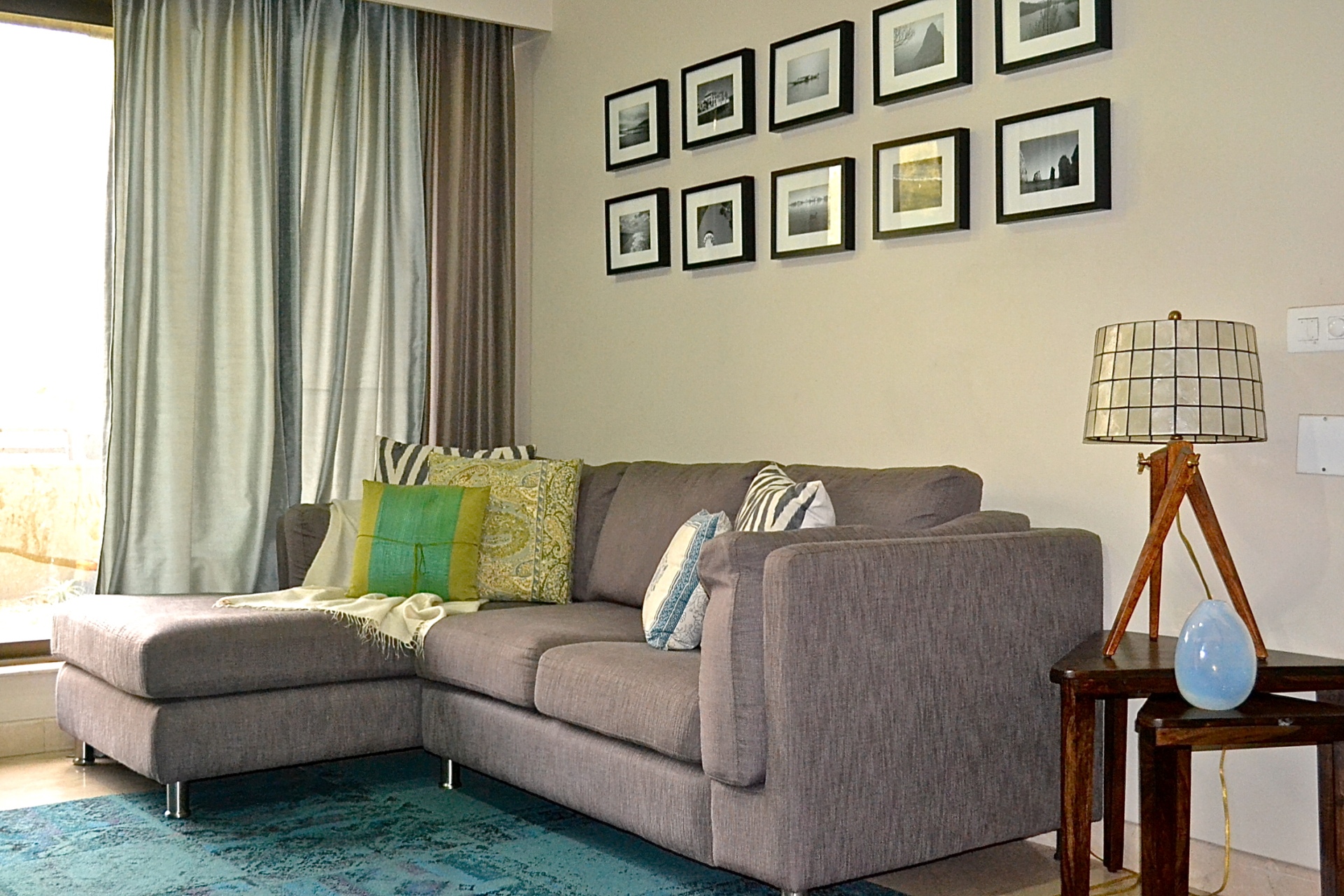
To begin with light to medium colour palate usage is safer than darker and bold colour palette in order to balance and harmonize the decor. Choose a colour palate of three or four colours to style your room using different shades of these. If the colours chosen for furniture and accessories are darker, then use curtains/drapes for windows and walls in neutral and pastels colours to give a illusion of more space and well balance of colours. For cosy spaces one can use dark colours on walls but still keep the soft furnishings neutral,” advices Vaishnavi Pratima Founder, Vaishnavipratima. However, finding the right colour scheme can be a tedious task if you are not aware of colour coordination. “The best way is to play safe and opt for subtle tones. When you are set out to decorate the room, the only way to add colours are through walls, furnishings and decor pieces. Happy hues like accent pink, turquoise blue, kale blend well with yellow, light mustard, rust orange and even crimson,” says Ashish Gupta, Director, InLiving.
Vasthu Matters
Colours are important to uplift the right mood of the space. “In vastu each direction is ruled by a planet for example west is ruled by the planet Saturn and the colour associated with Saturn is blue or black, so for west direction one should use shades of blue or black like this one can as per the direction and planet choose the appropriate colour to create a balance in the house,” says Vastu Expert Ridhi Bahl. It also helps to create harmony and balance when used in right order. Pooja Bihani, Founder and Principal Designer, Spaces and Design adds, “colours on the walls not only are a statement but also have fend shui properties and a response to the user in the habitat. Strategic and smart usage of colour can really enhance the life of the user in his environs and also give a great aesthetic appeal.”
Trend Check
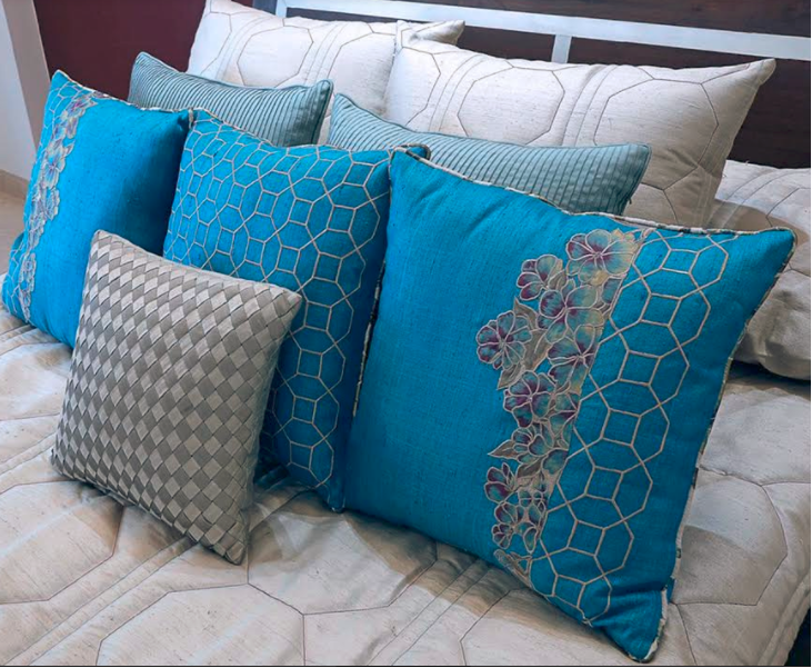
Pantone’s colour of the year is greenery while Asian Paints have come up with Intense Ocean. “I think both can be balanced well with lighter neutral shades in white, beige and neutrals. Keep your bedroom linen in these light colours while letting the trending colours space to breathe,” says Interior Designer Monika Kamal, Founder of Siddharth by MKC. Neutrals are trending this year ahead. “Whites, beiges, pale grays, camel, and blush pink are super on-trend. Gray was a prominent colour in 2016 interiors and it will continue to reign in 2017. We see different tones of gray, a lot of gray and white, and gray in deeper colours. It’s the sort of colour that complements a full spectrum of shades, from bold red to ivory,” says Ar. Gaurav Sanghvi – Joint Managing Director – Pentaspace Interiors+AAPL. Mushroom is the next big neutral colour. “Try it in your bedroom for the ultimate neutral colour walls and accentuate with colours like burnt orange, deep blue, dark gray. One can never get enough of those blues. Mix up with different hues of blues to add drama to your house,” says Mrinmayee Kundalia, Director, TUNI Interiors Pvt. Ltd.
Balancing Act
Tina S. Menda, Lead Interior Designer, Unishire avers, “creating balance in colour can start small with throw pillows, lamp shades and tablecloths, and can be achieved with inexpensive additions such as artworks on the walls and flowers in a vase.” Today, monochrome is the fashion and the focal point of the room is bright and colourful. “Monochrome sofa could be accented with bright cushions. And colourful paintings/ wall arts can be used in a subtle non colourful room,” says Ekansh Bansal, Architect, eb+D:Designs. Filippo Ricci, Creative Director, Stefano Ricci advices, “our choice is based on a balance between all different elements. We propose tones of brown Californian briarroot wood with travertine marble or, alternatively, black Californian briarroot wood with Pietra Serena.”
Ideas Galore
Warm colours and cool tones often go well together, creating a tasteful balance. But choose one contrasting pair rather than over-complicating things with too many combinations. “Make it a point to include various textures in the same space. You’ll notice that this creates more depth and interest in the room. For example, you can easily match a plush rug with leather furnishings. You can match textured pillows with smooth, soft upholstery,” says Kunal Mehta – Co-founder; Kanchi by Shobhna and Kunal Mehta. “Light is an essential part of balancing colour. A coloured light can help to change the whole ambience of a home and quirky lighting is the best way to showcase the creativity,” says Priyanka Das, Network Partner – PR Profession, GolinOpinion. Go ahead and add a dash of colour to your home.
Tips by Ishan Thacker, Design Consultant, Vector Projects (I) Pvt. Ltd
- Don’t match every tone or shade; try to blend in the environment.
- Small rooms appear cosy if lighters tones are used, similarly large spaces can experiment with darker hues.
- Place quirky knickknacks strategically in your neutral themed rooms, this can add an edge to your space.
This story appeared in Deccan Herald’s Homes & Interiors dated 9th June 2017 here