Doing up your home in rich colors can add an oomph factor like no other. Adding accents of deep gem tones, shiny metals, velvet upholstery and sleek black and white marbles can give a regal look to your home.
Do it Right
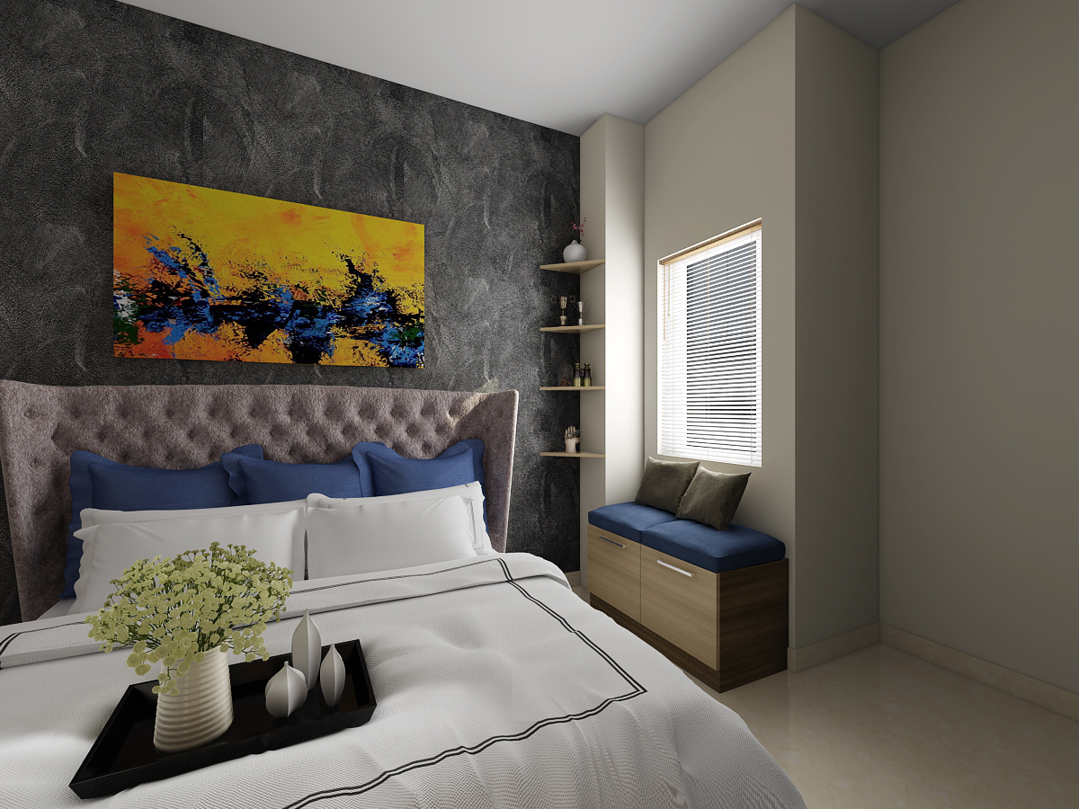
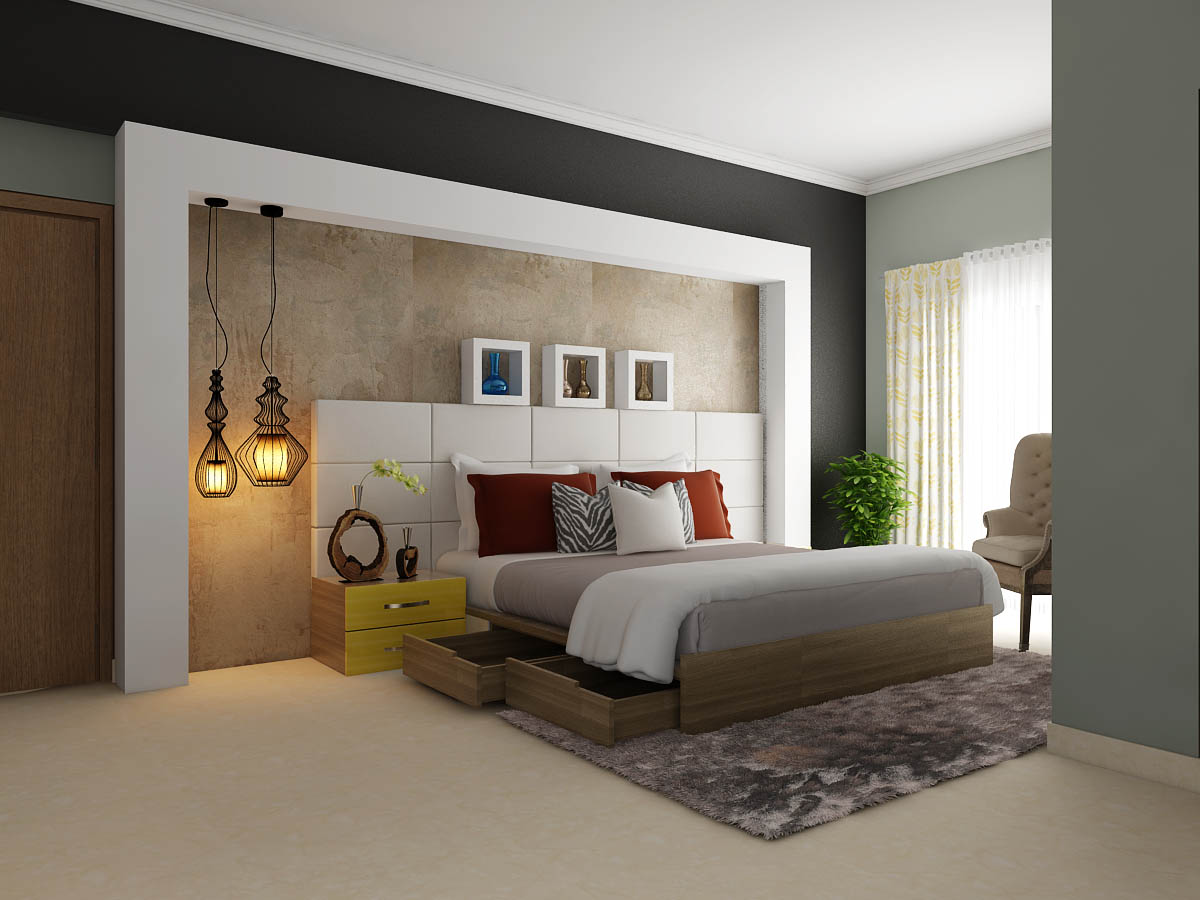
Moody colour palettes are dark and rich in colour and are ideal for the homes which have good natural lighting. The deeper gem stone colours fall under the rich colour palette; blend well with metallic furniture and accessories. Metallic colours like gold and brass add to the luxury element of a home. “Rich colours like sapphire blue and emerald green embellish the concept. Velvet upholstery reflects a regal taste. The dark velvet fabric gives extra comfort and gives a glamorous look. The sleek black and white marbles are yet another way to beautify the home with the moodier theme. These are typically used as the table tops in dining, kitchen and living areas,” says Sandesh Dhanraj, Founder and CEO of Noah Interiors. The key is to create a flow between textures – dark velvet upholstered sofas accompanied by metallic gold nested tables, all resting on white marble or wooden flooring. “The stark contrast between neutral, metallic and earthy tones creates a symphony of emotions and aesthetics. All these textures denote a warm and rich feeling, setting the mood for both indulgence and comfort,” avers Ritika Dhingra, Design Manager, Urban Ladder.
Colour Coded
Coloured metals and velvet upholstery share a common property of shimmer which enhances the luxury quotient in a decor. Moodier palettes can be perfect to give the raw look to a place, benches and coffee table and day beds are ideal to be used for an outdoor decor. These fit in well also in library rooms and media rooms in a home. “We can use deeper gem tones like emerald , royal blue or burgundy with coloured metals like rose quartz and copper which are different than the commonly used gold and silver. It can be used in making dining chairs and statement wing chairs and loungers and interesting doors,” avers Vaishnavipratima, Founder and Creative Head, Vaishnavipratima – The Interiors Studio.
Regal Repast
Different coloured metals can be used as an accent for the furniture. “We can use the metals as stand or as a base for furniture the table, side table and the finish can vary from high gloss to antique and so on. For deeper gem stones we usually recommended to use it as a table tops such as a dining table top or centre table tops. It comes in variety of colours,” says Reeshab Agarwal, Managing Director, Stellar Furnishings. Colour is the most emotional element in interior design and therefore we need to understand how it works in tandem with tones, hues and textures. Jyotika Purwar – Founder of Walter & The Studio, Mumbai, adds, “stones such as marbles, granite, onyx are a great way to create an instant sense of luxury in a room such as a feature wall. Back lit stones can look like art pieces in a room. Deep colours tend to be serious, so have fun with the interiors and it is possible to create an eclectic, warm, inviting space with a touch of sparkle.”
Balance Matters
A key factor that must be kept in mind when doing homes using moodier tones is to ensure that there is a sense of colour balance. Using too many of these colours may cause a jarring effect and hence it is important to introduce these shades in niches and ensure there are contrasting elements that actually help highlight them. Dr Madhu Kotiya, Colour Therapist explains, “while using rich colour palettes in upholstery, complement the décor by using lighter shades for wall colours. Using darker shades on the walls will result in cluttered energy and heaviness in the house. Ideally, walls should always be painted with pastel and light colours.” For instance if you are using a lot of white and cream everywhere then black marble accents would look great. If you have a lot of darker shades in the upholstery, then balance it out by using light marble flooring or surfaces. Nibhrant Shah, Founder & CEO of Isprava adds, “use these colours as a statement and keep the basics neutral. A single couch in a deep blue or mustard coloured velvet can look beautiful when paired with a marble counter top coffee table and metallic accessories.” Be bold and do up your home in bright tones. Shami and Ritu Goregaoker, Design Directors, GA Design explain, “it may seem a little risky initially, but moody colour palettes can actually liven up a space as it gives a sense of dramatic luxury. Because of the risk factor, more people tend to opt for safer colour palettes like neutrals, thereby making moody colours more exclusive. A lot of bright colours in one room can make the room look busy, so ensure that these are balanced with softer textures.” So get ready to make a splash with colour this New Year!
Handy Tips
- Use darker colours in the rooms which get the most natural light.
- Keep flooring light in colour.
- Balance the moody colours with lighter tones of wood.
- Either do walls or furniture moody, not both.
- Do not use very bright colours everywhere and on everything that will make the place gaudy.
- Do not use too many throw pillows to fill up sofas.
- Avoid dark walls in smaller rooms.
- Velvet upholstery looks fabulous with metallic legged furniture.
- Avoid using too much of indigo colour as it makes the atmosphere claustrophobic. Go for lighter shade of indigo.
This story appeared in HT Estates dated 13th Jan 2018 here:
I love your blog, It’s always been one of my favorites 🙂 Thank you so much for sharing this post.
Thank you Emman.